Extensive Charting

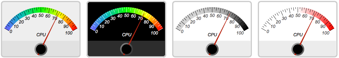
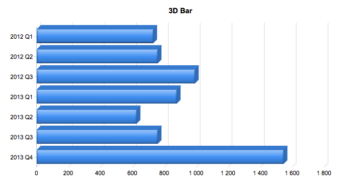
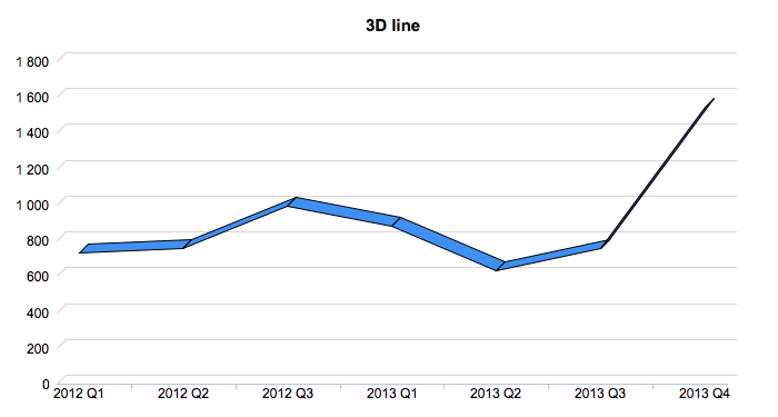
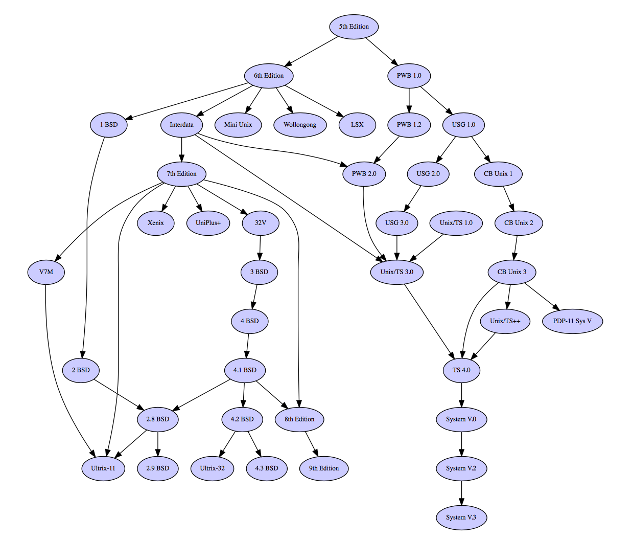
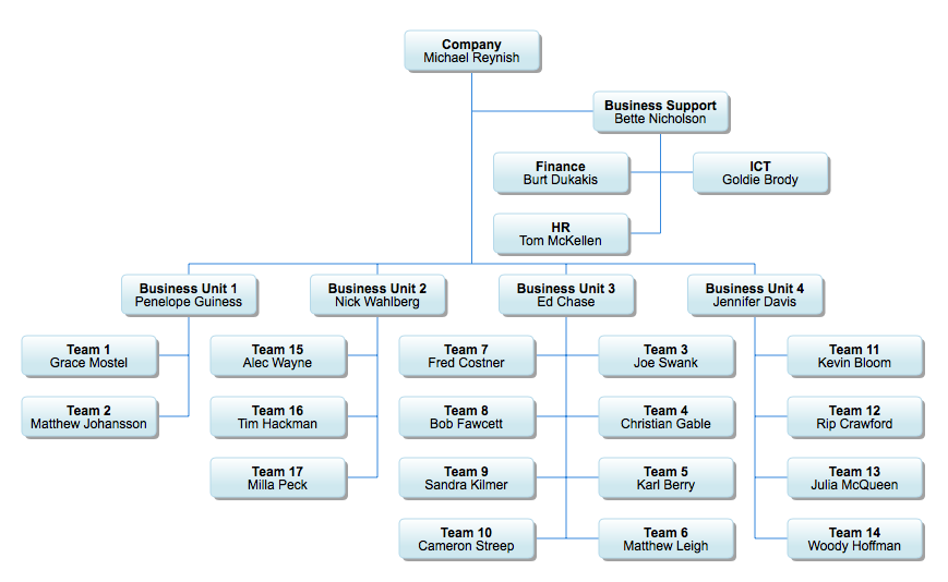
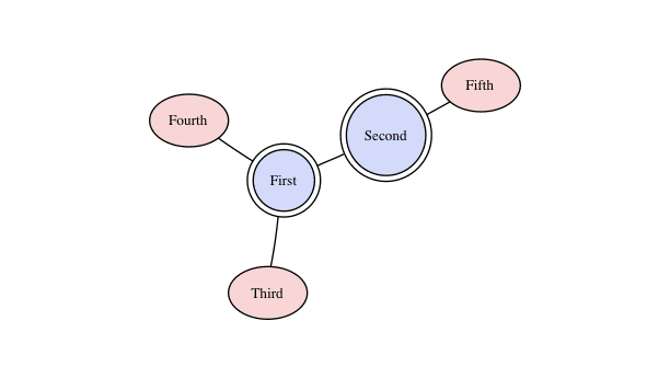
With myDBR’s built-in charting capabilities, you can easily add great-looking charts to your report. Creating a chart requires just a single command. You can also easily transpose the data to suit your charting needs. myDBR supports a wide variety of XY, multi-series, meter, hierarchy, and network charts.


Sample Charts

2D Column 2D Area 2D Bar 2D Donut 2D Pie 2D Stacked Area 2D Stacked Column 3D Area 3D Bar 3D Column 3D Donut 3D Line 3D Pie 3D Stacked Area 3D Stacked Bar 3D Stacked Column Bubble Cone 3D Cone Funnel 3D Funnel Gantt Hierarchy Organization Line Meter Multi Series 2D Area Multi Series 2D Bar Multi Series 2D Column Multi Series 2D LineDY Multi Series 3D Column Multi Series 3D LineDY Multi Series Line Percent Area Percent Bar Percent Column Multi Series Spline Multi Series Stepline Multiseries Line DY Multiseries Spline DY Polar Scatter Network PolarArea PolarLine PolarSpline PolarSpline Area Pyramid 3D Pyramid RadarArea Multiseries Column Spline DY Multiseries Column Spline DY 3D RadarLine RadarSpline RadarSplineArea Scatter Spline Stepline LinearMeter RectangularMeter Semicircle Donutpercent Semi-Donutpercent 3D Bubble Sankey BoxWhisker Chord Floatingbox Trendline 3D Scatter Multiseries 3D Scatter

Click on a chart to see the full-size chart

myDBR supports different charting modules and you can choose the ones that suit your needs. myDBR also supports diagrams based on Graphviz and D3js technologies, you can draw the diagrams directly from your data.

Chart customization

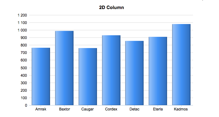
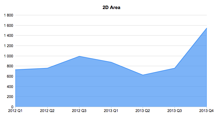
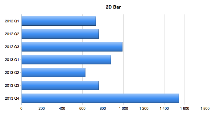
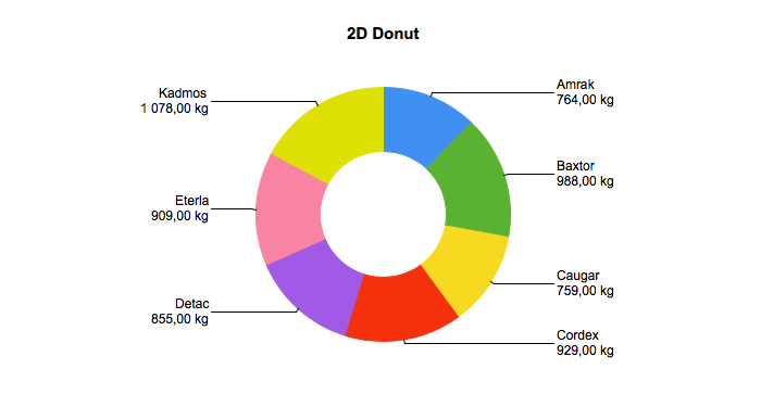
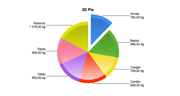
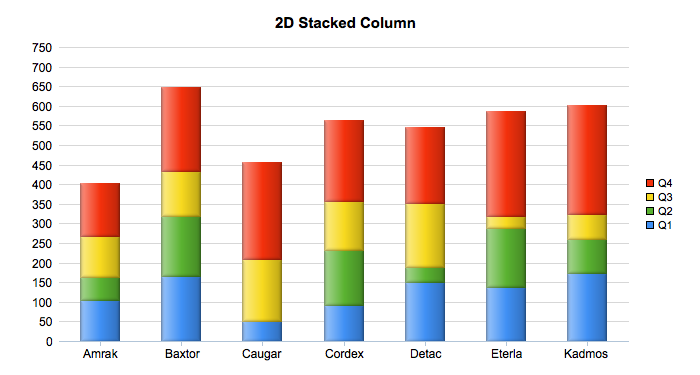
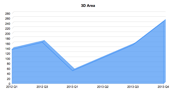
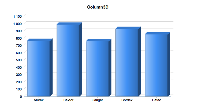
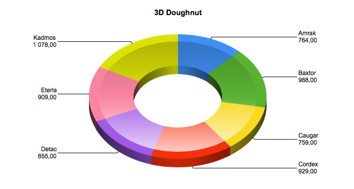
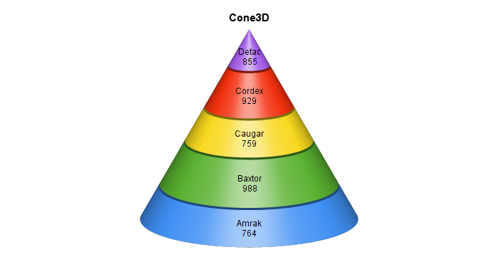
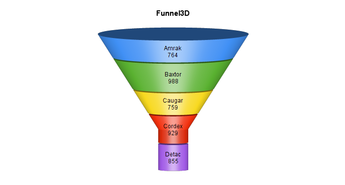
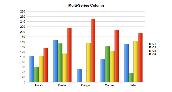
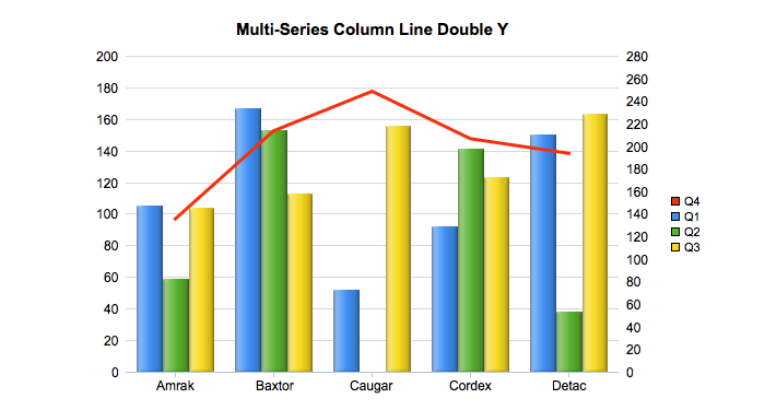
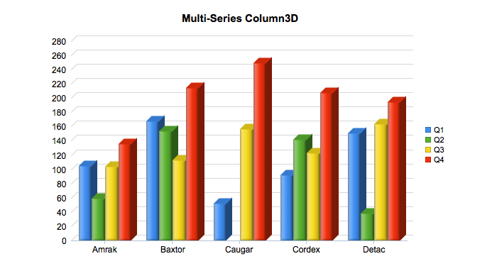
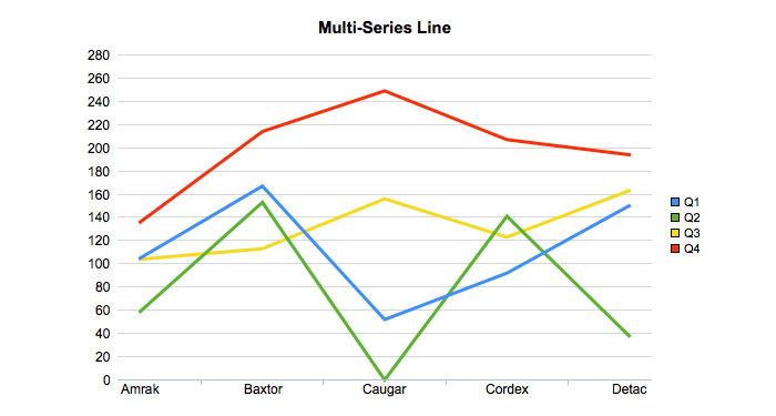
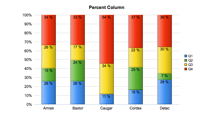
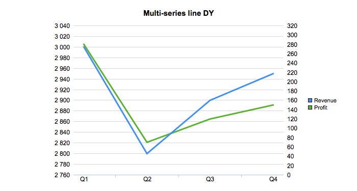
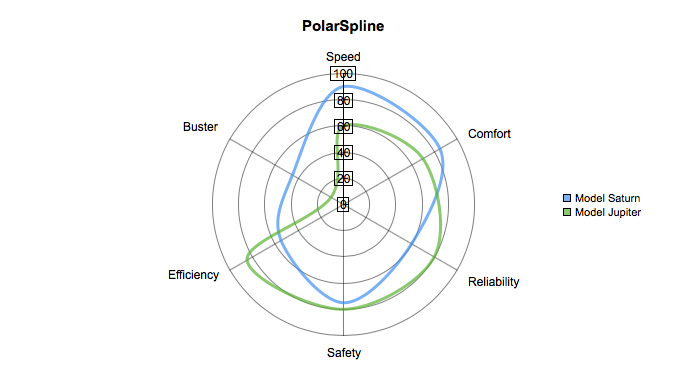
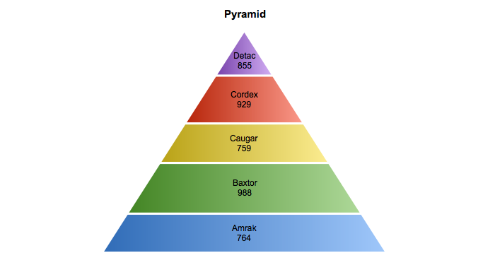
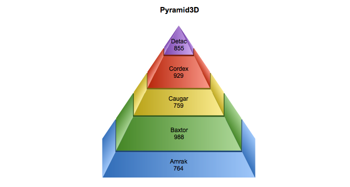
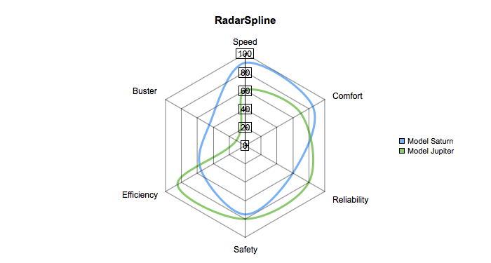
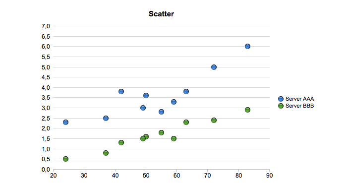
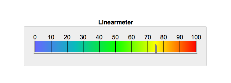
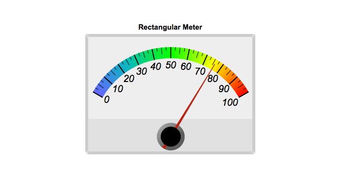
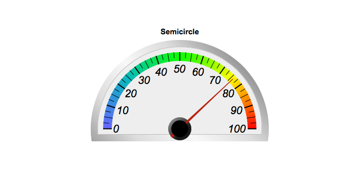
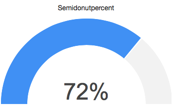
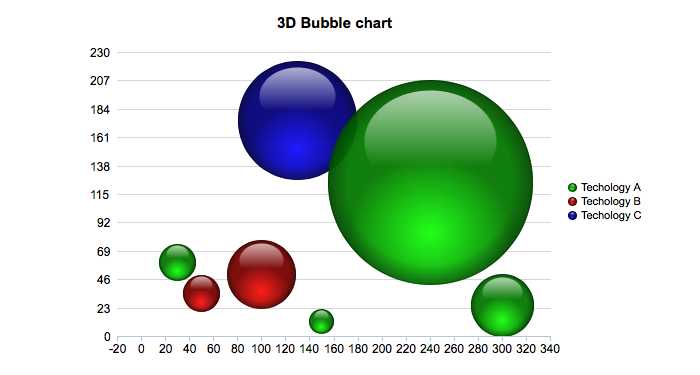
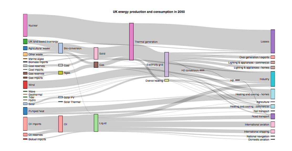
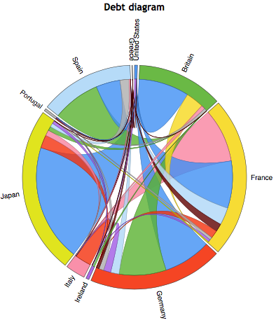
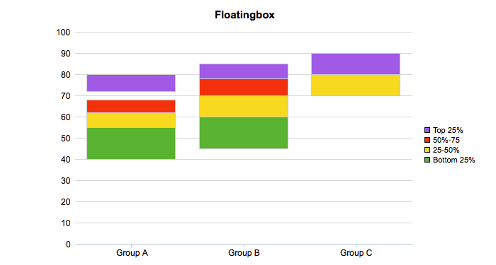
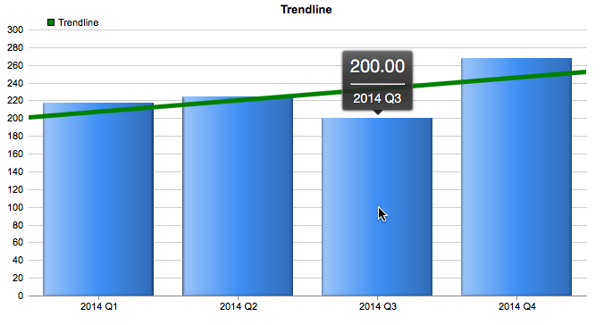
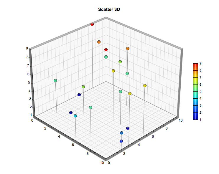
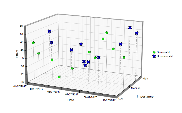
You can use myDBR charts with their default setting (all customization is optional), and the basic setup is launch-ready. myDBR offers a wide range of options to customize the charts and style the overall appearance in different ways. All parts of the charts can be customized: colors, sizes, titles, axis, legends, labels, borders, line thickness, backgrounds, etc.

Customize chart